Making the @FT Covid Vaccine Visualization
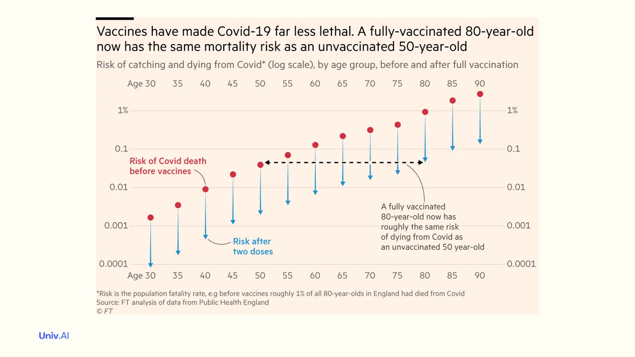
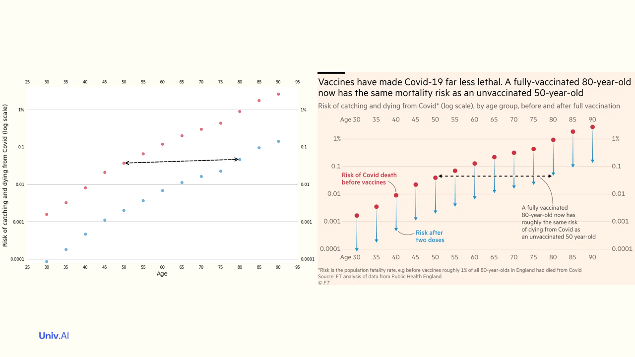
- Two weeks back, in the thread https://twitter.com/rahuldave/status/1425200284301725708, I talked about the visualization in this image from the financial times (@FT) https://www.ft.com/content/0f11b219-0f1b-420e-8188-6651d1e749ff?hcb=1 . Here I tackle the production of such an image in @matplotlib .
-
And in another thread on Keeping it Simple: https://twitter.com/rahuldave/status/1427705386434392067, I talked about some of the ins-and-outs of @matplotlib, in the context of removing chartjunk from images. Here we'll use those techniques and some new ones...
-
I used Engauge Digitizer, to extract the data points from the @FT graph. And the built-in OSX utility, Digital Color Meter, to figure the colors used there. The data and the notebook used to produce this thread are available at https://gist.github.com/rahuldave/df75d3aa73e95e8361b7cdd1663c9868.
-
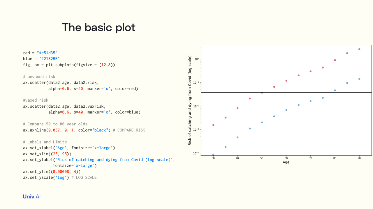
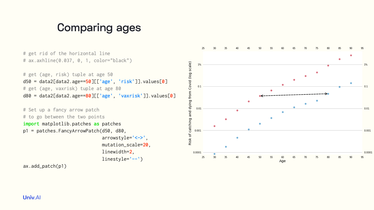
At first I made a simple image of the data, with the red points representing the unvaxed risk, and the blue the vaxed risk. I put a rough black line to compare the danger to an unvaxed 50 year old with that of a vaxed 80 year old.
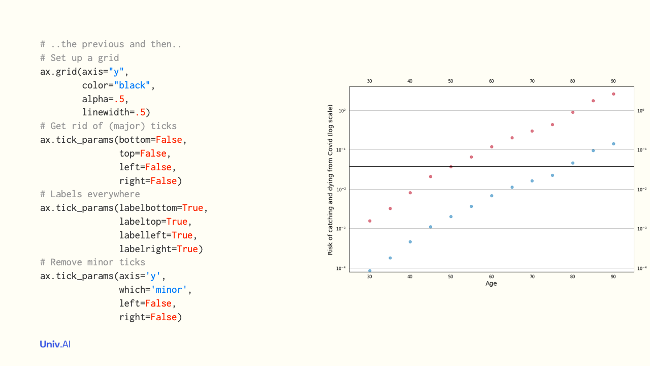
- I then set up a grid like in the original plot, put labels everywhere, and get rid of external tick marks. You can read more about ticks at https://e2eml.school/matplotlib_ticks.html by @brohrer
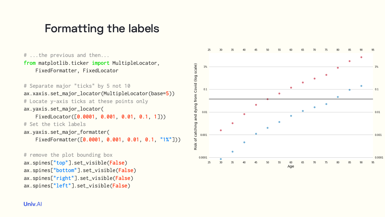
- I formatted the ticks the way the @FT article did, and removed the spines that make up the plot bounding box as well.
- I replaced the horizontal line comparing ages with an arrow, as in the original image. The arrow is drawn as a Patch, which is an aribitrary 2-D region in matplotlib. Read more about Patches in @brohrer's course https://e2eml.school/matplotlib_patches.html and in the @matplotlib docs.
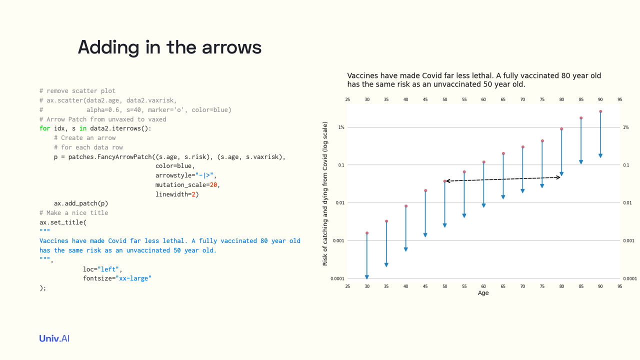
- At this point, our image is beginning to take shape. But we have data points for the vaxed case instead of arrows! I'll use Patches to fix this!
- By using patches I have now added an arrow for each age in our dataset! I also add a formatted title. We are getting closer to the final image. I need to annotate the plot and make it have the right color!
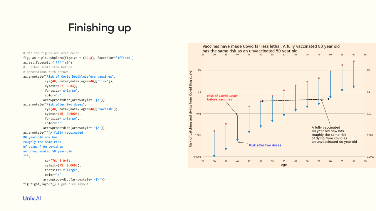
- I finally set both the figure and axes color and add 3 annotations. The annotations use arrows, which go from the xytext coordinates to the xy co-ordinates. The annotations serve as legends, and describe the main conclusion.
-
I'll tackle more visualization stuff in future tweet threads, including the principles of good visualization and how to achieve them with @matplotlib . Follow me on twitter at @rahuldave and keep an eye on https://stories.univ.ai for more!
-
Permalink to thread here: https://stories.univ.ai/makingthecovidviz/! If you'd like to learn Data Science and AI more formally, you might want to check out my company's programs at https://univ.ai/programs/, and the thread https://twitter.com/rahuldave/status/1424793241019428864 (discounts inside).