Visualization As Story
- There is this pretty famous book by Steve Krug, called "Dont Make Me Think". Its a call to respect conventions for web elements, such as shopping carts (a cart should be on the upper right), so that the web experience is obvious to users.
-
In visualization, as in web development, your audience does not want to spend cognitive effort on things you could just show them, by convention, or by explicit writing. So, just point out the key facts and insights.
-
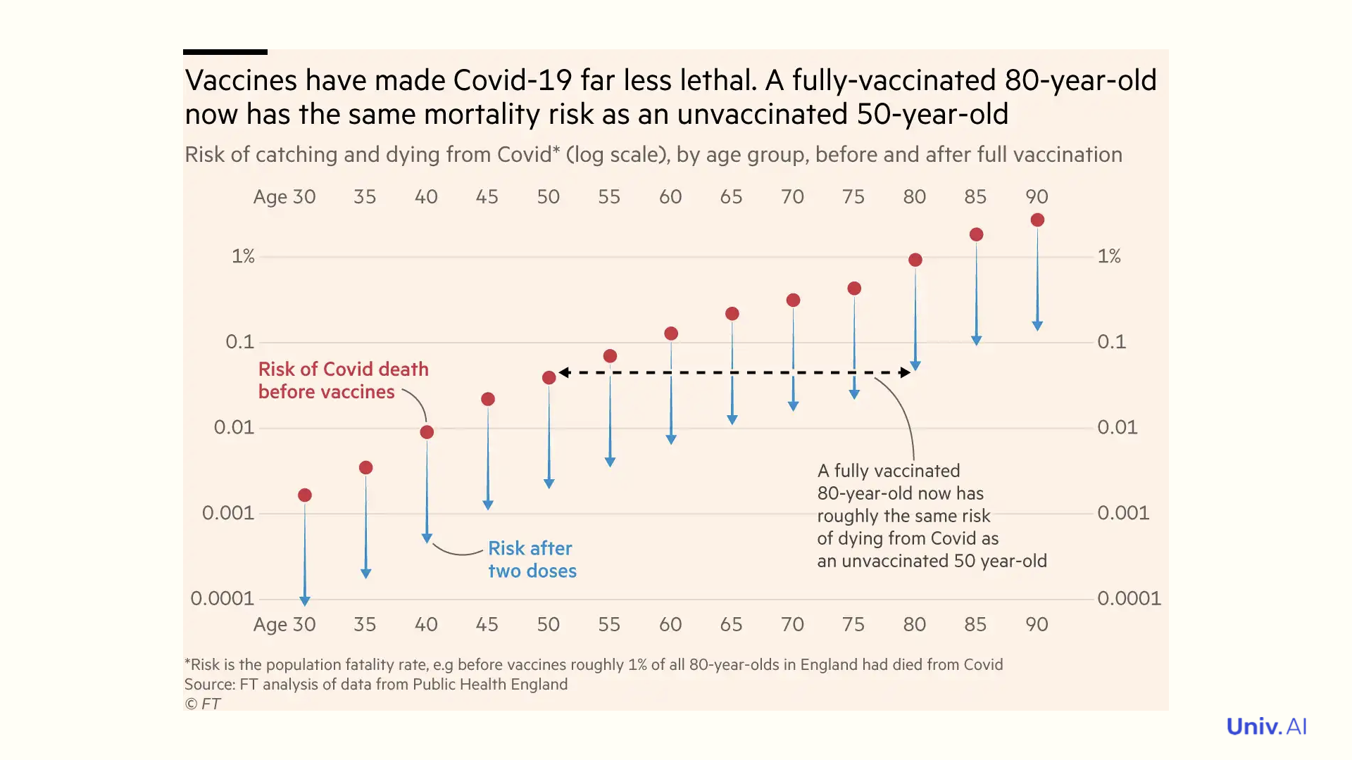
For example, in this great article in the financial times https://www.ft.com/content/0f11b219-0f1b-420e-8188-6651d1e749ff?hcb=1, the main point "Vaccines have made Covid-19 far less lethal" is written up-front.
-
The implications are made clear in the second sentence, comparing vaccinated 80 year-olds to un-vaccinated 50 year-olds. This implication is illustrated in the visualization as well, with a horizontal black line, and a caption.
-
Instead of point markers, downwards pointing arrows are used on lines to reinforce the notion of lower risk. Captions and annotations are used to point out key insights. Extraneous frames and tick marks are removed.
-
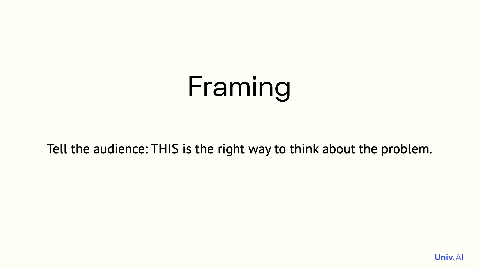
This is an example of framing. It grabs the audience and leads it through the insights you want to share.
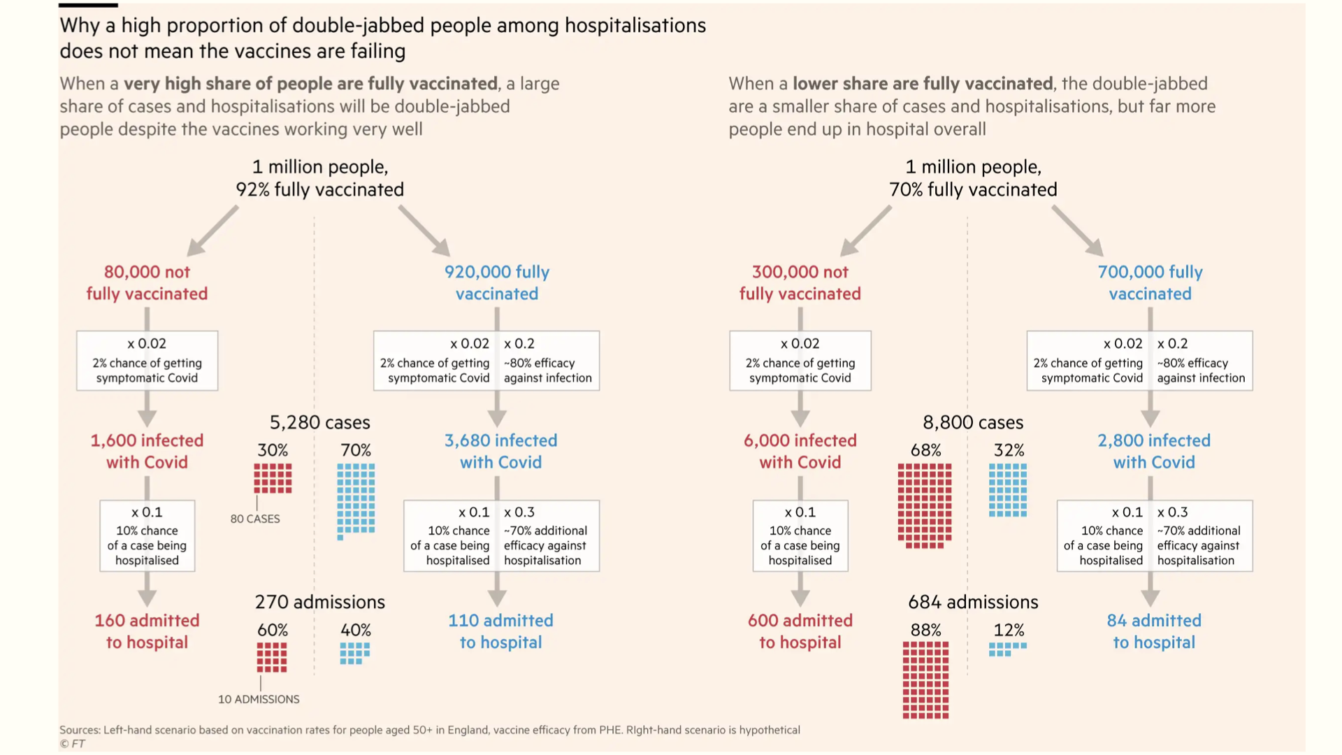
- There's been a lot of worry about breakthrough vaccination, especially with the news about the Provincetown cluster. Here is another visualization from the same article, telling us why the large number of breakthrough infections are to be expected.
-
It walks us through the entire calculation visually. And does it in two scenarios: high vaccination rates and low vaccination rates. We can ourselves see the larger hospitalization numbers in the low-vaccination scenario.
-
The visualization and explanation could have been framed in terms of base rates and conditional probabilities, but by illustrating the concepts with an example, they are made accessible to everyone. And the framing drives home the story: go get your shot!
-
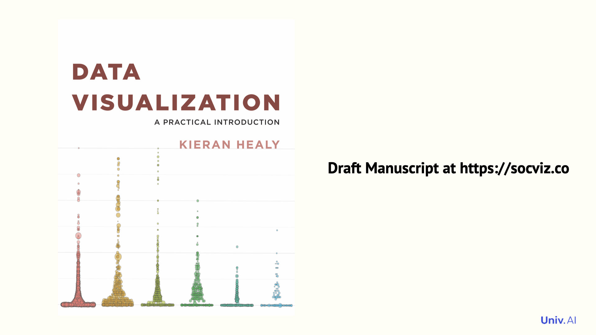
Read more on how to make good visualizations using R in this book by @khealy . If you are a pythonista, learn how to make good plots in @matplotlib using https://end-to-end-machine-learning.teachable.com/p/navigating-matplotlib-tutorial-how-to/ by @brohrer .
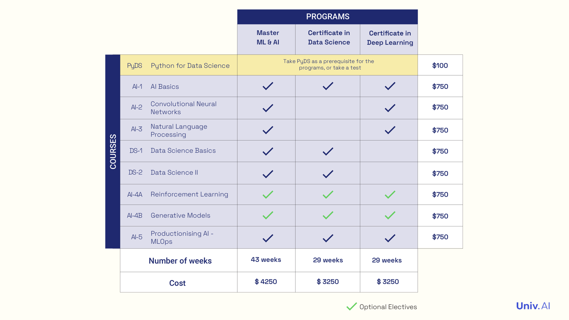
- I teach this as part of my Data Science Basics Course as well. DS-1 can be taken by itself https://www.univ.ai/courses/, or as part of the Data Science and Master programs https://www.univ.ai/programs/.
- This story is permalinked at https://stories.univ.ai/vizasstory/. If you like short threads on fun topics in data science, statistics, ML, and AI, follow me on twitter at @rahuldave and keep an eye on https://stories.univ.ai for more!